Introduction
If you are familiar with machine learning, you will probably have encountered categorical features in many datasets. These generally include different categories or levels associated with the observation, which are non-numerical and thus need to be converted so the computer can process them.
Playing with numbers is all well and good, but sometimes you have non-numerical elements that may provide insight into the data you are exploring visually.
In this tutorial, you’ll learn the common tricks to handle this type of data and preprocess it to build machine learning models with them. More specifically, you will learn:
-
Strip Plots with and without jitter.
-
Violin Plots .
-
Swarmplot.
-
Boxplots.
For this tutorial we have choosen Iris dataset. Iris dataset contains details of different type of flowers.Four features were measured from each sample: the length and the width of the sepals and petals, in centimeters.
The Baseline
A categorical variable (sometimes called a nominal variable) is one that has two or more categories, but there is no intrinsic ordering to the categories. For example, gender is a categorical variable having two categories (male and female) and there is no intrinsic ordering to the categories. Hair color is also a categorical variable having a number of categories (blonde, brown, brunette, red, etc.) and again, there is no agreed way to order these from highest to lowest. A purely categorical variable is one that simply allows you to assign categories but you cannot clearly order the variables. If the variable has a clear ordering, then that variable would be an ordinal variable.
However, with so many tools where does one begin. Well, enter categorical plots with seaborn.
To initiate the input/output process, we have to import libraries . Import pandas library followed by seaborn and Matplotlib library. Here we are using Iris dataset.
import pandas as pd
import seaborn as sb
from matplotlib import pyplot as plt
df=sb.load_dataset('iris')
Here we will print the sample dataset .
df.head()
Table
| id | sepal_length | sepal_width | petal_length | petal_width | species | |
|---|---|---|---|---|---|---|
| 0 | 0 | 5.1 | 3.5 | 1.4 | 0.2 | setosa |
| 1 | 4.9 | 3.0 | 1.4 | 0.2 | setosa | |
| 2 | 4.7 | 3.2 | 1.3 | 0.2 | setosa | |
| 3 | 4.6 | 3.1 | 1.5 | 0.2 | setosa | |
| 4 | 5.0 | 3.6 | 1.4 | 0.2 | setosa |
In this section, we will learn about categorical scatter plots.
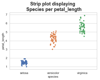
Strip Plots
When a scatter plot is all that is needed, feel free to try the .stripplot() method. This method takes the arguments x (categorical column), y (numerical column), data (dataset), hue and jitter are optional. The hue argument provides another feature to further divide the data. While, the jitter argument allows for us to space out the data points to visualize the data better. Note: The split (i.e. now dodge) method can be used to even split the data more.
‘stripplot()’ is used when one of the variable under study is categorical. It represents the data in sorted order along any one of the axis.
# Mentioning the title
plt.title('Strip plot displaying \n Species per petal_length', weight='bold', fontsize=18)
#Buiding Strip Plot without jitter
sb.stripplot(x="species", y="petal_length", data=df)
sb.set(style="whitegrid", font_scale=1)
# Displaying the output
plt.show()

Strip Plots with jitter
In the above plot, we can clearly see the difference of petal_length in each species. But, the major problem with the above scatter plot is that the points on the scatter plot are overlapped. We use the ‘Jitter’ parameter to handle this kind of scenario.
Jitter adds some random noise to the data. This parameter will adjust the positions along the categorical axis.
plt.title('Strip plot displaying \n Species per petal_length', weight='bold', fontsize=18)
#Building Strip Plot with jitter
sb.stripplot(x="species", y="petal_length", data=df, jitter=True)
sb.set(style="whitegrid", font_scale=1)
# Displaying the output
plt.show()
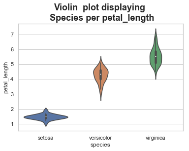
Violin Plots
The ‘violinplot()’ method provides an opportunity to better understand the underlying density for the categorical data. Out of all of the plots , this one feels like the one with the most interesting story. However, this may not be a typical plot that most people have seen so understand your audience.
A violin plot plays a similar role as a box and whisker plot. It shows the distribution of quantitative data across several levels of one (or more) categorical variables such that those distributions can be compared. Unlike a box plot, in which all of the plot components correspond to actual datapoints, the violin plot features a kernel density estimation of the underlying distribution.
# Mentioning the title
plt.title('Violin  plot displaying \n Species per petal_length', weight='bold', fontsize=18)
#Building Violin Plot
sb.violinplot(x="species", y="petal_length", data=df, split=True)
sb.set(style="whitegrid", font_scale=1)
# Displaying the output
plt.show()
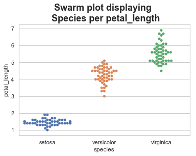
Swarmplot
If you fancy the strip plot but need a better data representation, then the ‘swarmplot()’ method provides the best of both worlds. It combines the strip and violin plots to show all points. Be careful as this may not scale well with larger datasets. However, this is a really cool feature for exploratory data analysis.This function positions each point of scatter plot on the categorical axis and thereby avoids overlapping points −
The advantage of using swarm plots is it gives a better representation of the distribution of values, although it does not scale as well to large numbers of observations (both in terms of the ability to show all the points and in terms of the computation needed to arrange them).
# Mentioning the title
plt.title('Swarm plot displaying \n Species per petal_length', weight='bold', fontsize=18)
#Building Swarm Plot
sb.swarmplot(x="species", y="petal_length", data=df)
sb.set(style="whitegrid", font_scale=1)
# Displaying the output
plt.show()
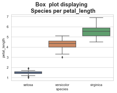
Box Plots
A box plot (or box-and-whisker plot) shows the distribution of quantitative data in a way that facilitates comparisons between variables or across levels of a categorical variable. The box shows the quartiles of the dataset while the whiskers extend to show the rest of the distribution, except for points that are determined to be “outliers†using a method that is a function of the inter-quartile range.
The ‘boxplot()’ method provides a great display for the distribution of categorical data using the box and whisker approach. The plot displays the quartiles the data falls into with outliers as well. This accepts the x (categorical column), y (numerical column), data (dataset), and an option hue argument to further separate the data.
# Mentioning the title
plt.title('Box  plot displaying \n Species per petal_length', weight='bold', fontsize=18)
#Building Box Plot
sb.boxplot(x="species", y="petal_length", data=df)
sb.set(style="whitegrid", font_scale=1)
# Displaying the output
plt.show()
Conclusion
By going through this guide, you have covered how to plot categorical values using Seaborn library.